

Our design lead Gwen talks through the latest changes to our brand design
Four years since our inception, Ozone has today unveiled a fresh new look – one that will be applied across every element of the organisation. Over to Gwen to explain more…
At the beginning of 2022, we made the decision to refresh the look and feel of how we present the Ozone brand. As a relatively new business, this wasn’t a time-driven decision, rather it represented the need to look holistically at our various brand elements that had been introduced on an ad-hoc basis during a period of speedy growth. It wasn’t necessarily time for a rebrand, but it was definitely time for a ‘glow up’.
We focused on three key areas for this refresh – our name, our logo and our colours.
Say it as it is – Ozone
Having been The Ozone Project since launch, we felt it was time to mirror what people called us – and that is by being simply referred to as Ozone. It’s how our customers – both publishers and advertisers – talk about us, and now as a successful scale-up business, we felt the ‘Project’ element of our name had done its job. Needless to say there will be some contractual, legal and financial areas where we’ll still be referred to as Ozone Project Ltd (least of all this URL) but for the most part, just call us Ozone.
A more balanced identity
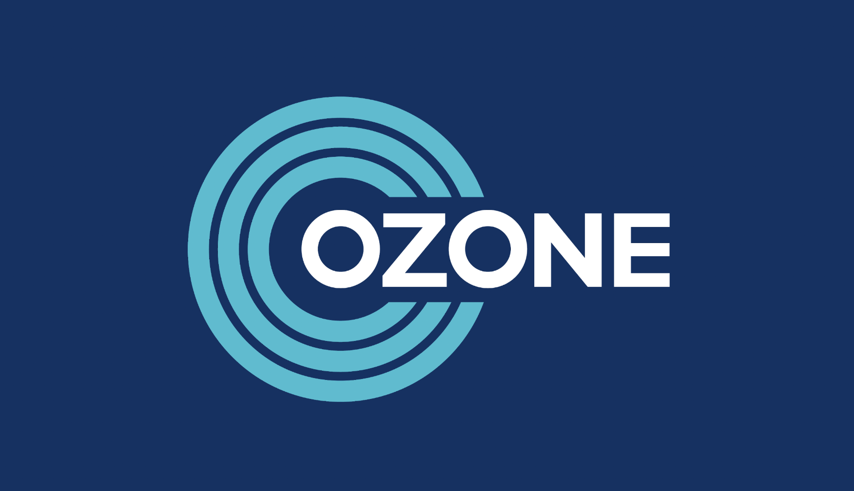
We really liked the concentric rings that formed the ‘mark’ element of our logo – anyone that’s picked up a piece of Ozone merch will have seen we have a lot of fun with it. However, we also felt the previous balance was a bit out of kilter, with the mark overpowering the name of the business. Our new design does both justice, incorporating the name into the mark, and using three outer rings to represent those Ozone ‘protects’ and represents in the digital advertising world – advertisers, publishers and consumers.

A brighter future
At Ozone we regularly talk about creating a brighter future for digital advertising through premium solutions for brands and publishers. And while it might sound a bit of a stretch to incorporate that sentiment into some brand colours, we believe we’ve taken a big step towards that. Our primary colour is a rich navy that embodies a bold, quality feel, while three accent colours in bright blue, pink and green add the fun and playful element Ozone has been known for. These new colours also gave new life to our audience illustrations that represent the huge reach Ozone delivers across the UK population
